When the Roebling bar closed its doors in late 2019, it was an end of an era mourned by many a soccer player who had sought it out for a post game beer. But fear not. With Bohemien, they will have a great place to chill after practice; this time in a reinvented Hifi space entirely built for intimate conversation within a powerful yet soothing soundscape.
When the clients are a Scandinavian woman and a Frenchman, with many likes ranging from minimalist to Art Nouveau, I was faced with finding a balance between the two. Additionally, Bohemien is a Hifi bar; significant investment has gone into making this the third of its kind in NYC, so the idea of sound was important too. Tarek, Patricia and I love to collaborate over a Pinterest board in order to hone in on ideas, colors and look-and-feel. For visual photo-sensitive individuals, this method works better than words. By narrowing down pins, we arrived at a direction, which I could then take off with in Illustrator. Some key elements that evolved are the pill shape, derived from Alfons Mucha posters and the on-site horseshoe shaped bar, the round stylized speakers symmetrically placed on each end, and the art nouveau elements that have been parsed by Scandinavian modernism.
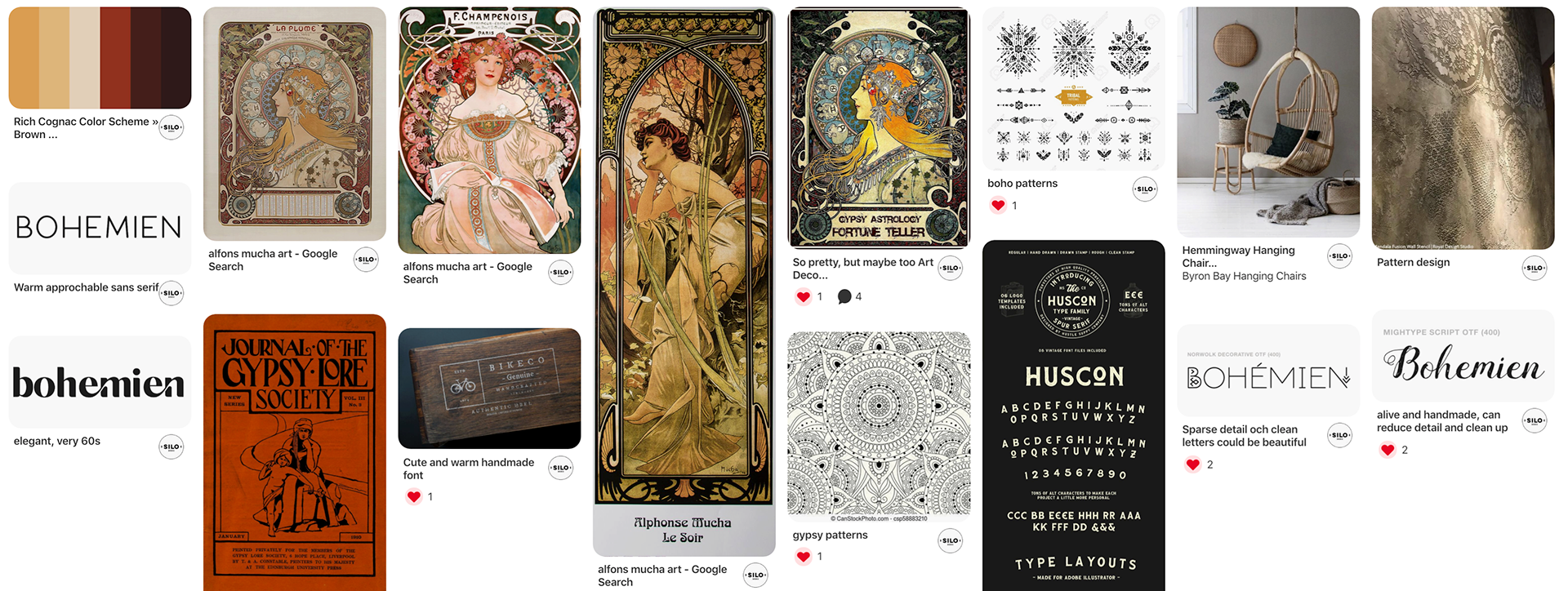
At the onset of a project, I often share a secret Pinterest board with my clients. Here, we pin wildly at first, then we discuss and narrow down. Above is the narrowed down result. The purpose of this is to get on the same page visually, and to discover each others' sense of taste. This way, I can better cater to and advice my clients.
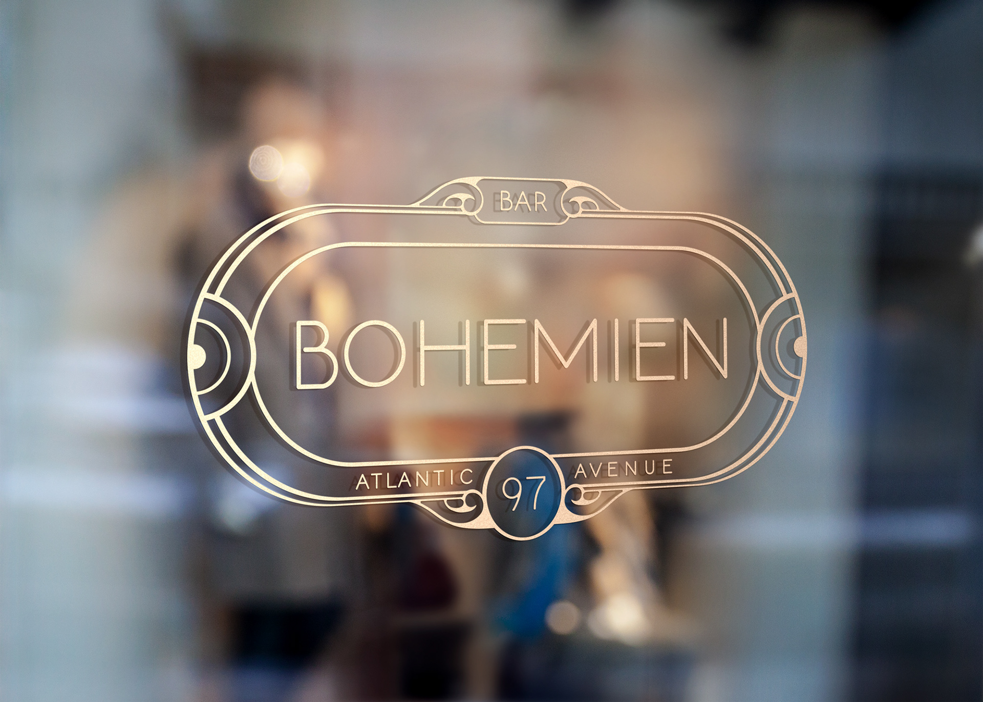
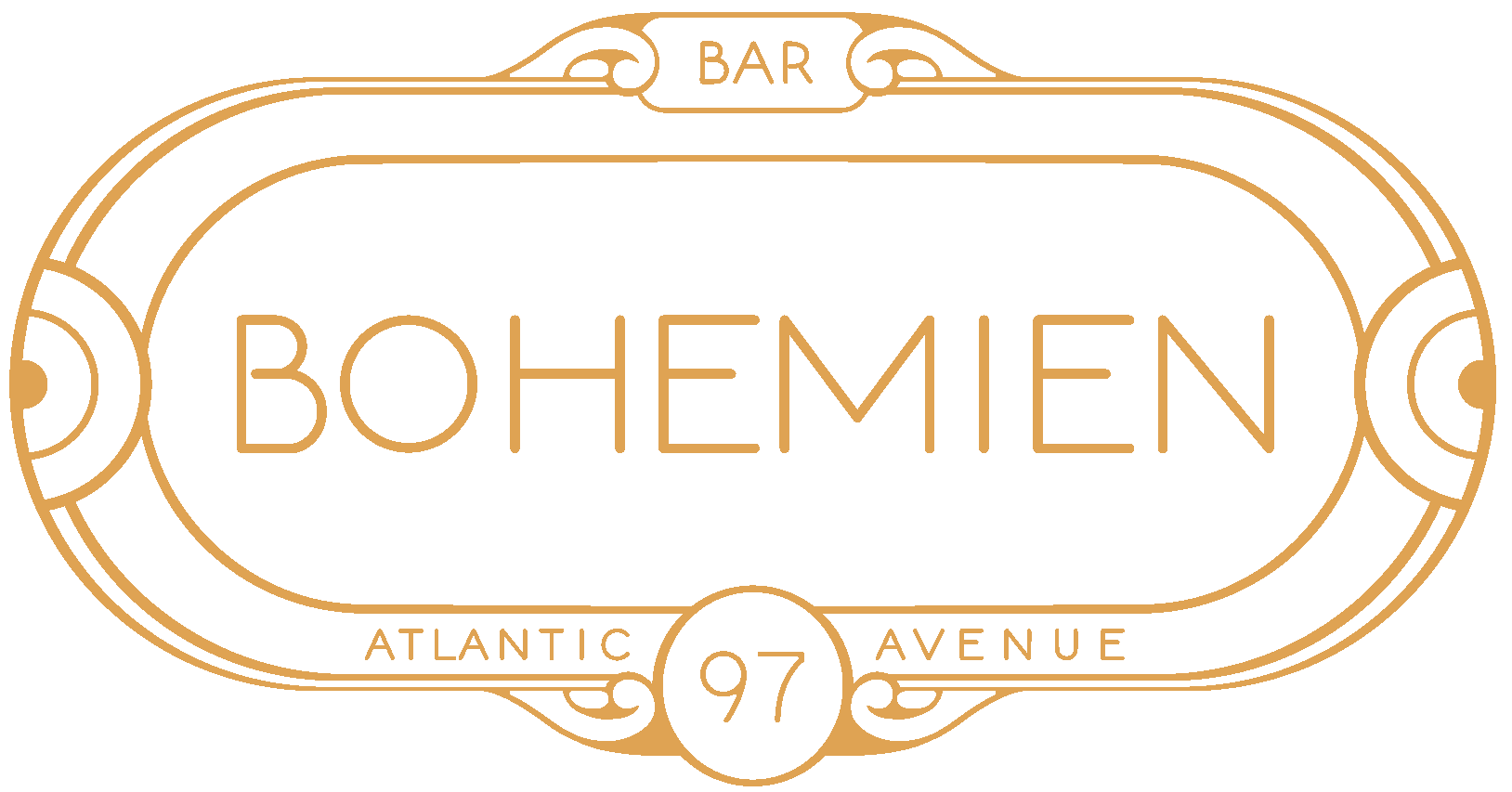
Logo
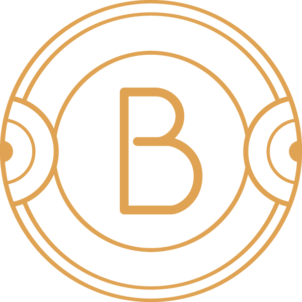
The logo is always completely worked out in black and white first, because it guarantees that it will look at least this good wherever it goes.
Then, color is explored and applied. This is a 'brassy gold' that align well with the interior of the Bohemien, where cognac colors warm up the space.

Custom social icons
Because most social platforms have a circle to fill, and it can become quite awkward to try and fit a logo nicely in there, I often design a custom social icon for my clients. It looks visually related to the logo.

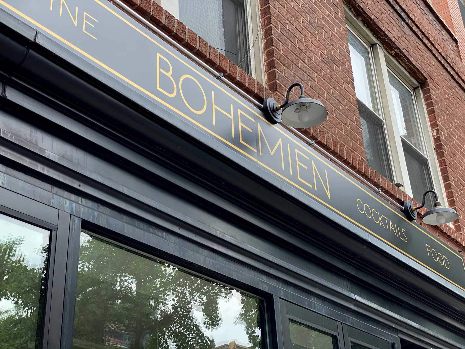
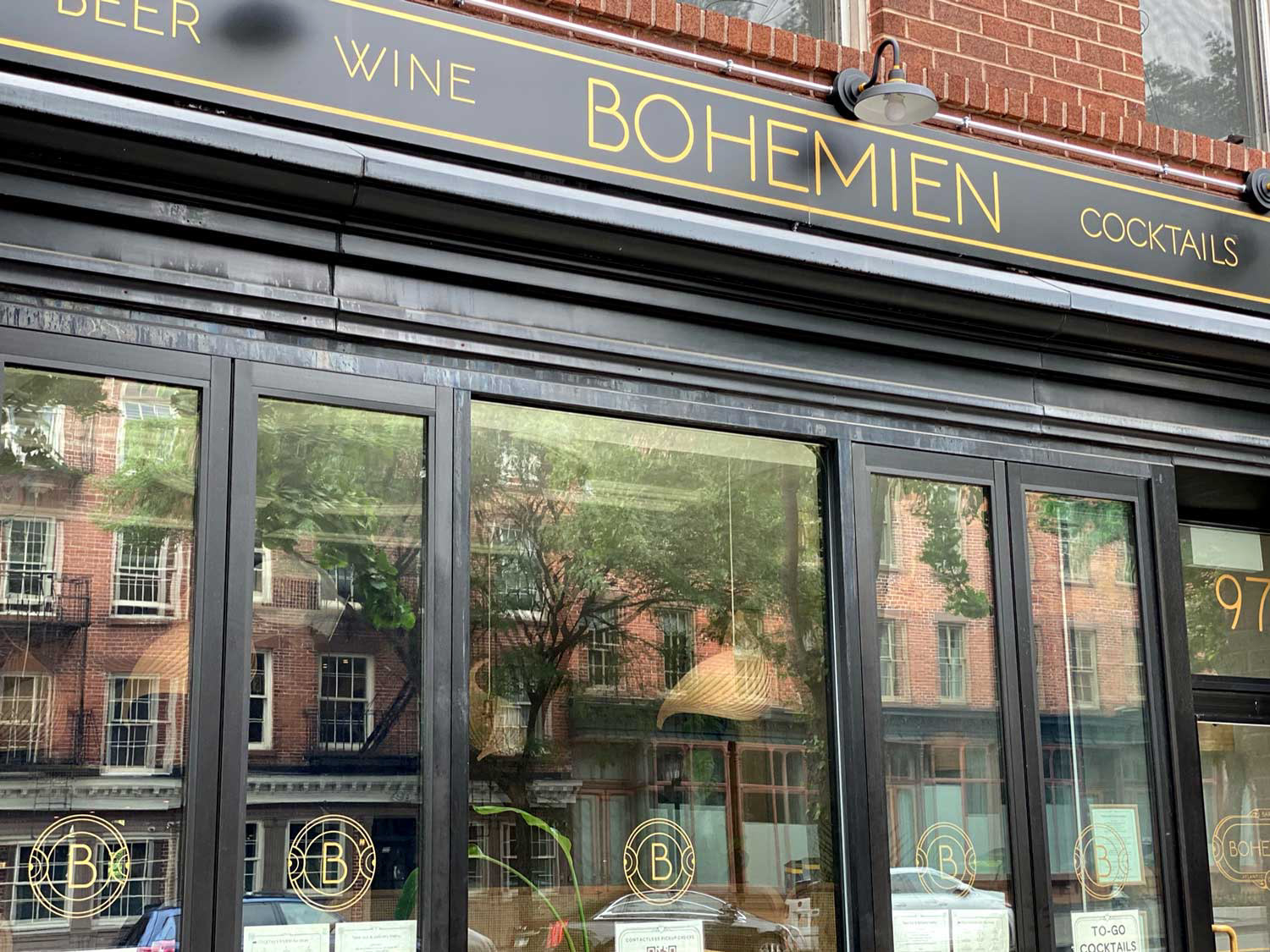
Restaurant facade
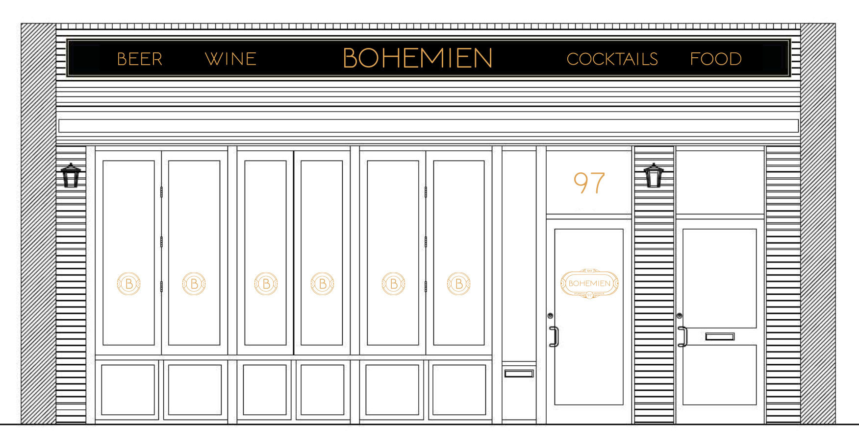
The logo is prominent on the entrance door, while the social icon is utilized on the smaller vertical windows. The awning takes custom typography, based on the font Norwalk.
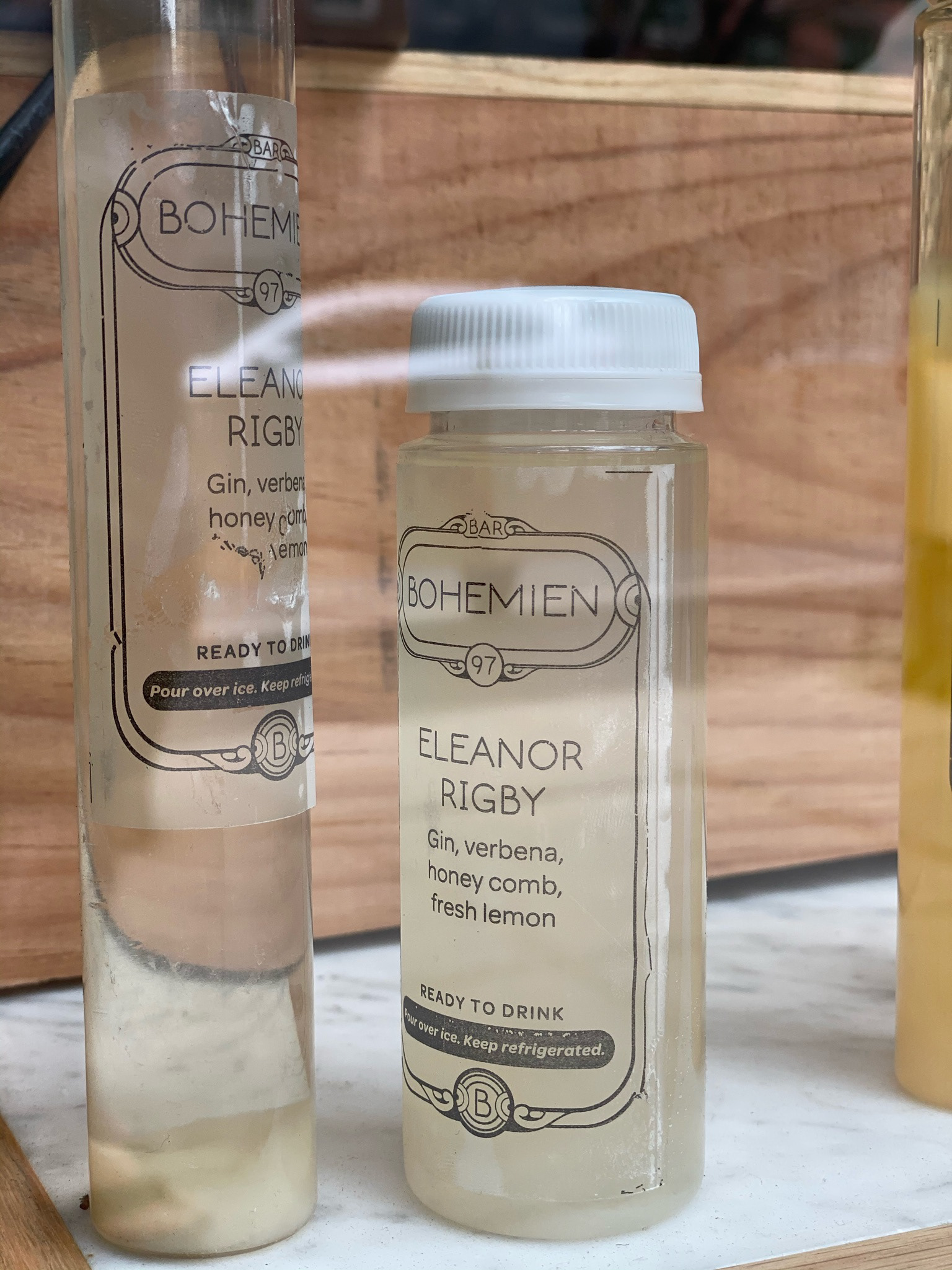
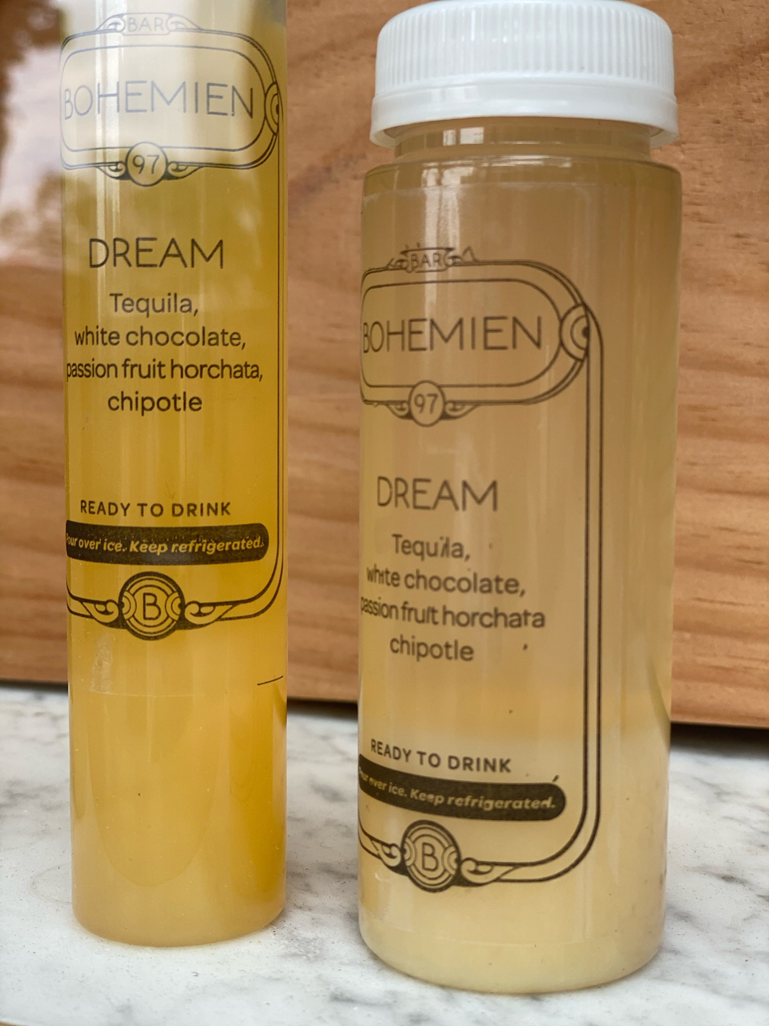
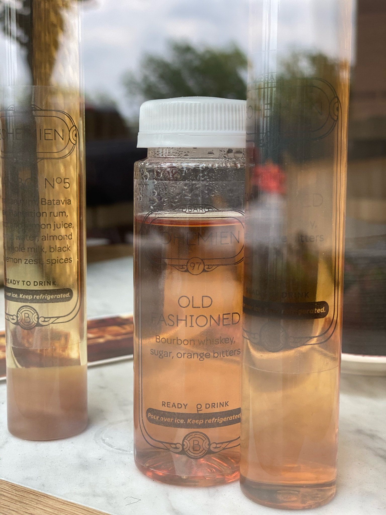
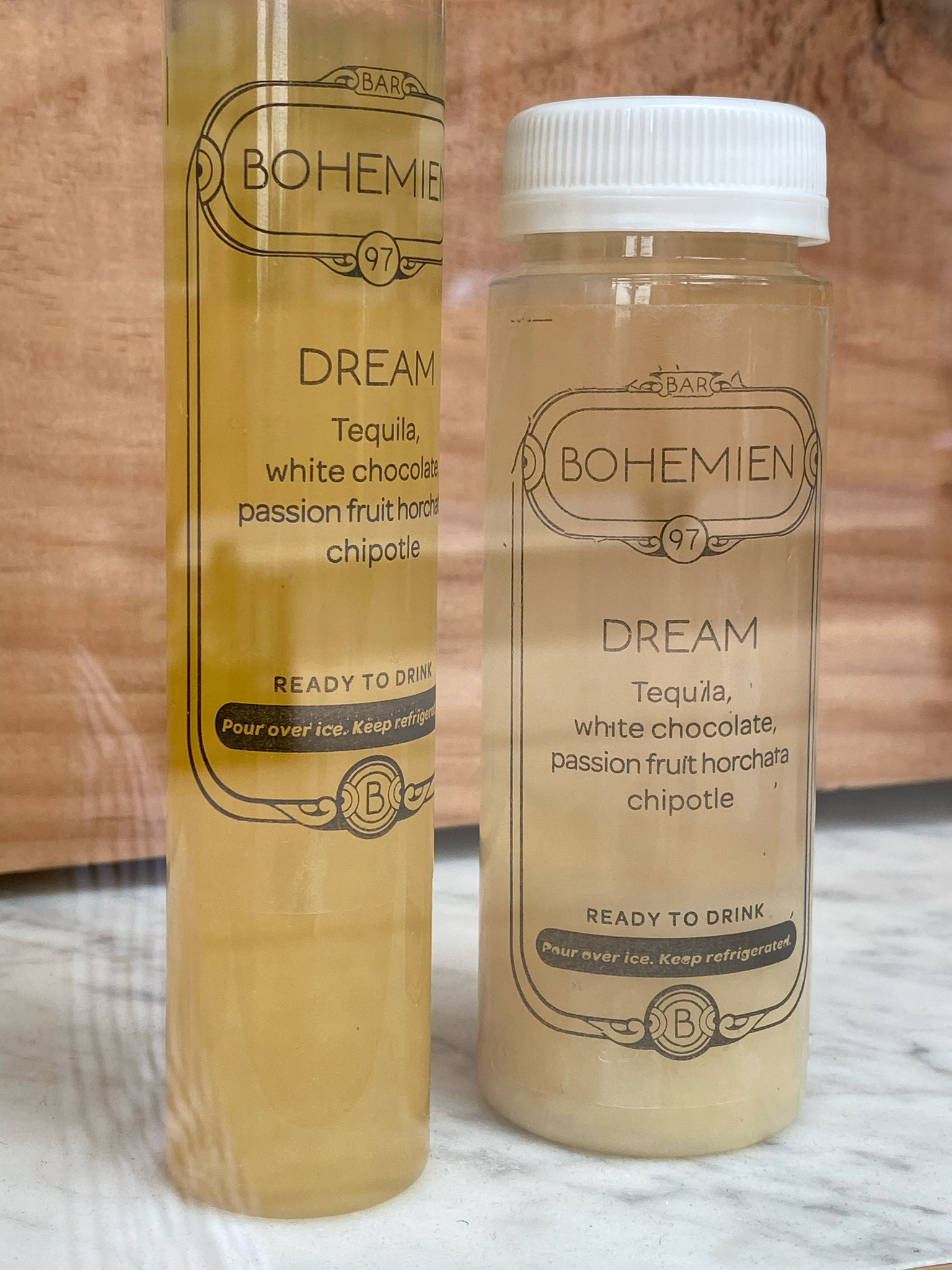
Bottled cocktails
An easy add-on to your food delivery order during those pandemic days.
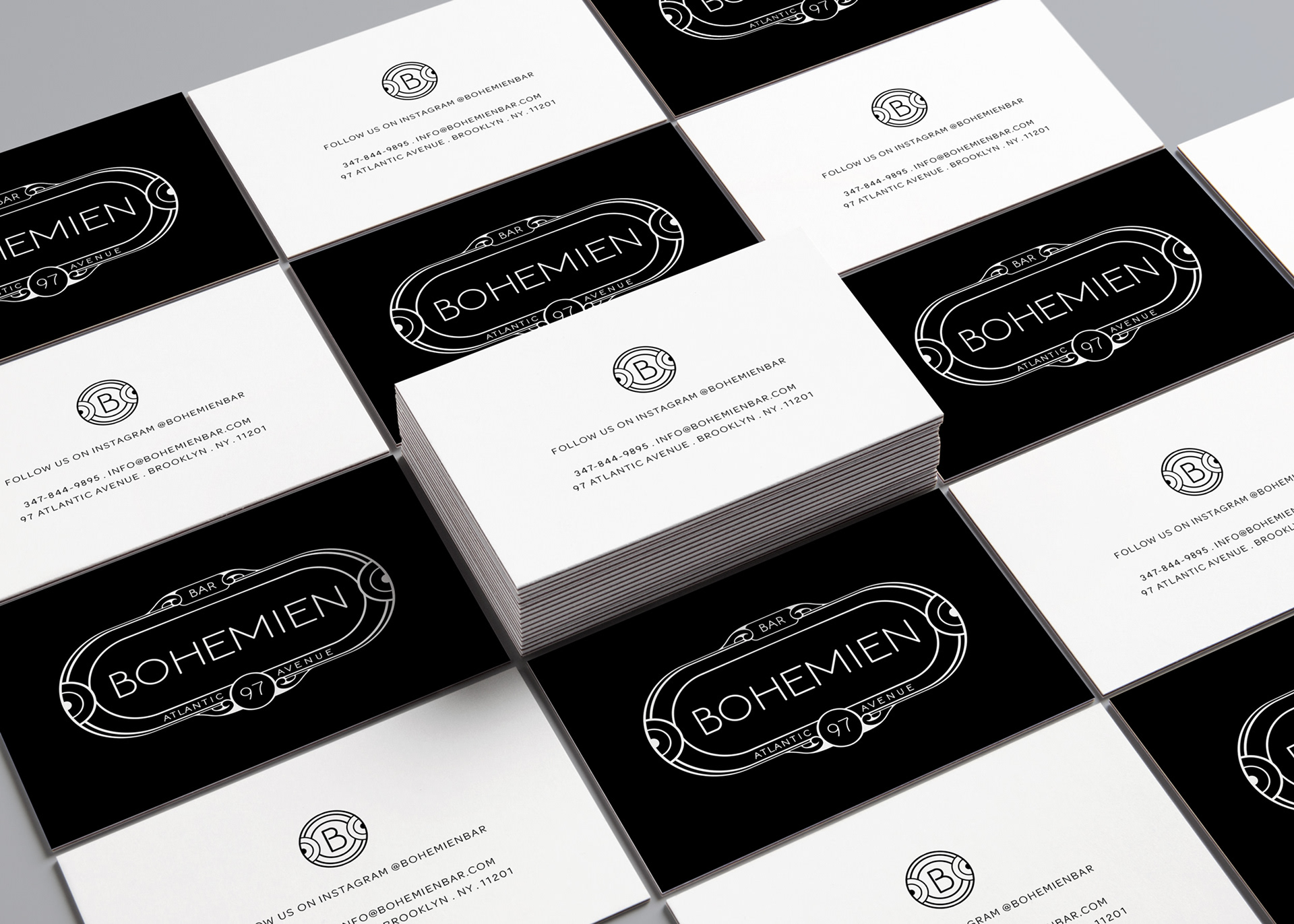
Generic in-restaurant card
For placing around the restaurant so patrons easily can snag one
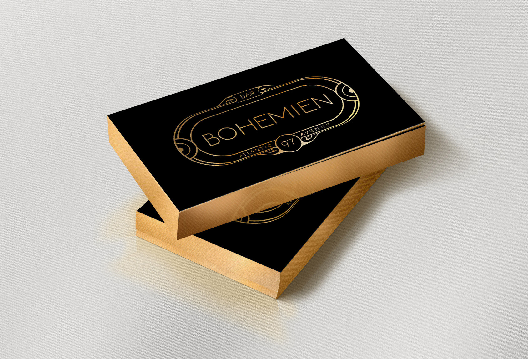
Personalized owner business card
On a luxe black stock, with gold edges and embossed gold foil.
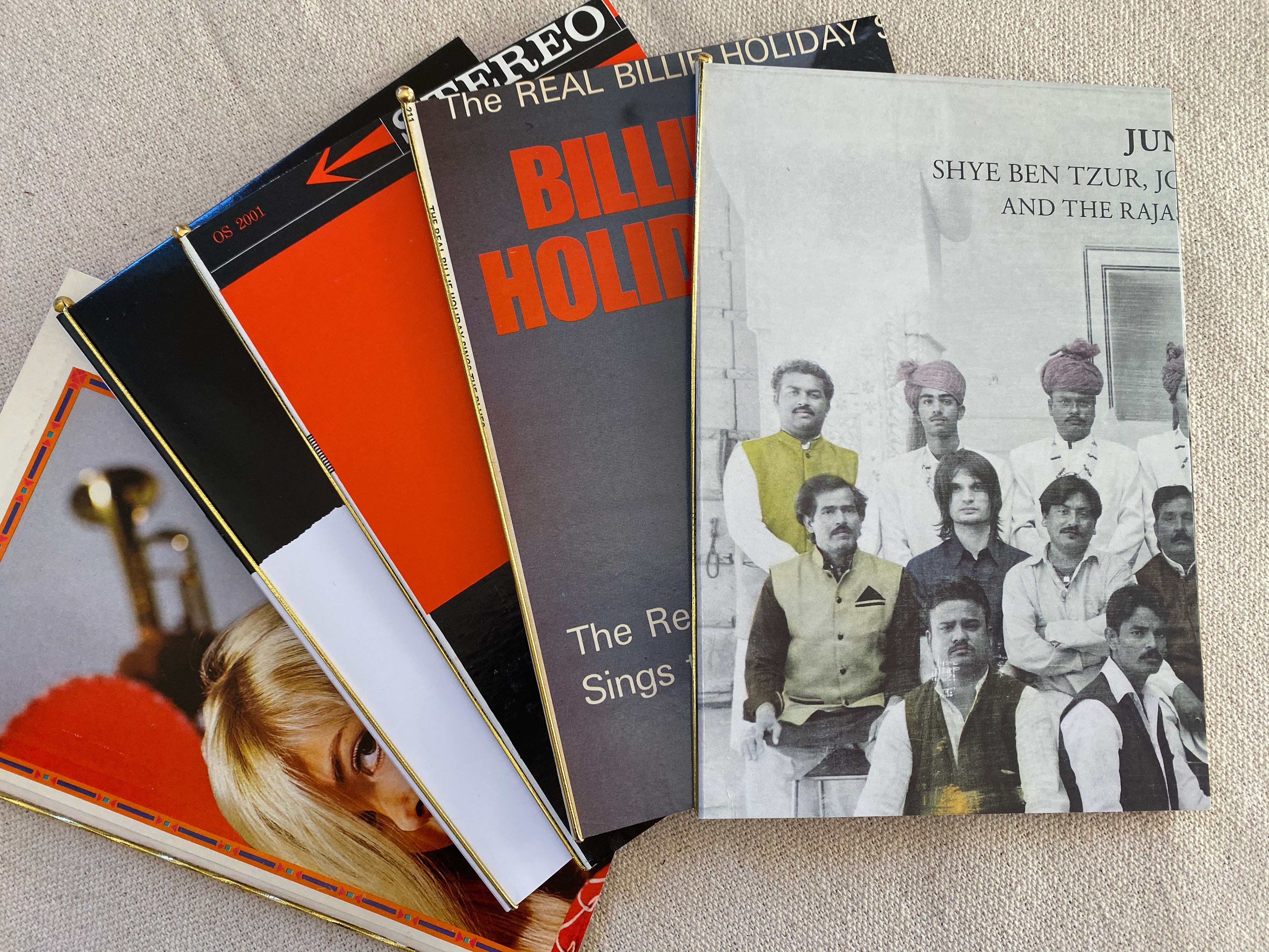
Menu
These menus are made from re-purposed vintage vinyl 12" covers. They were cut to size, then fit with an elastic band, before the printed menu was folded and inserted.
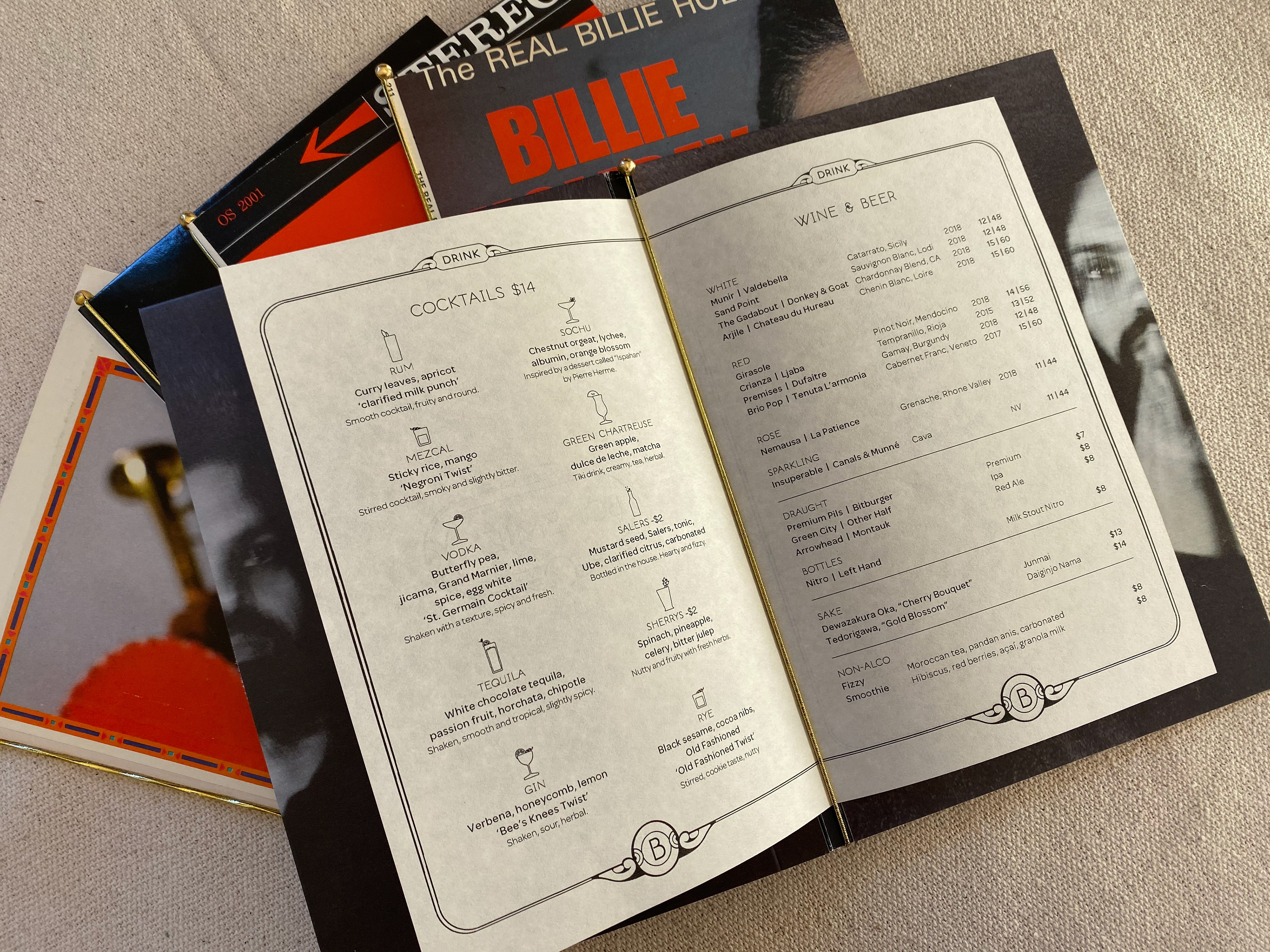
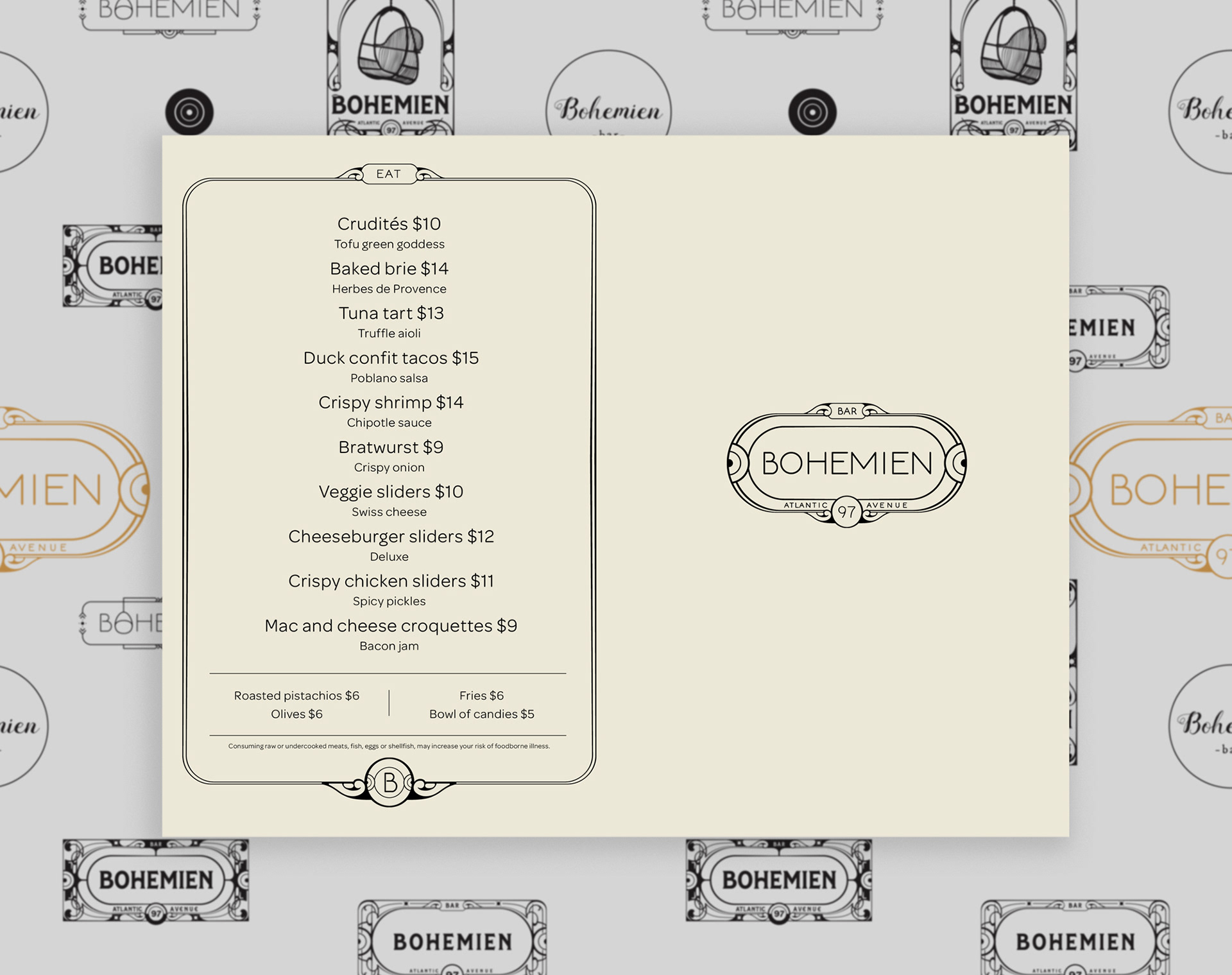
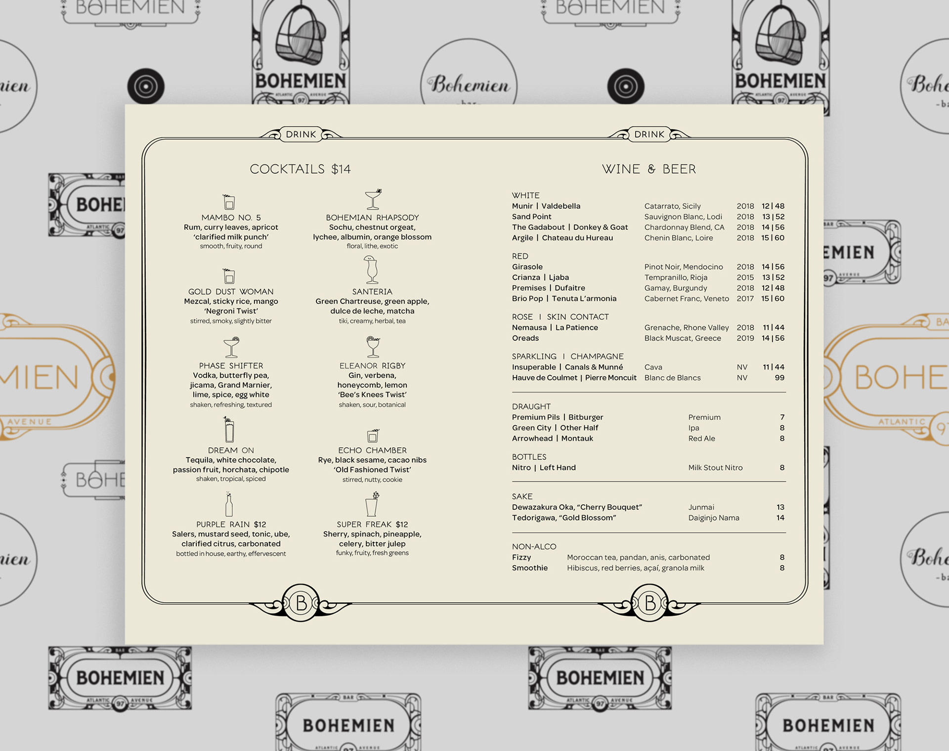
Because so many people secretly prefer certain glass types, we took the guessing out by adding custom glass icons.
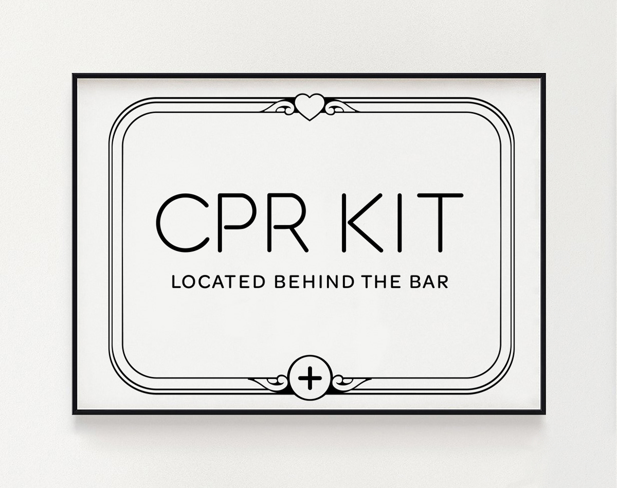
CPR Kit signage
All bars and restaurants must have one. But not all have it set in custom type.
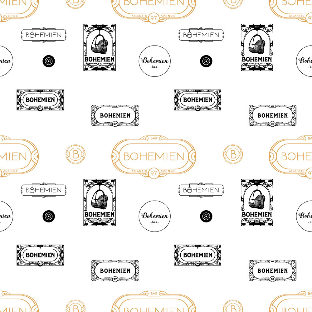
Custom wallpaper for the restaurant
The wallpaper features the approved logo in gold, surrounded by the logos that represents the evolution of the final logo.